Page 12 of 18
Re: New look Ableton website.
Posted: Sun Oct 28, 2012 9:02 pm
by Rosko
eric_c wrote:The overall design sense of Ableton (new site, Live 9 and Push) is really strong, especially when compared to other music software and hardware makers. They have always had a look that seemed very carefully considered and executed with far less emphasis on decoration and superfluous elements. I'm really enjoying the new look, but I can understand the website could stylistically be a bit of an acquired taste. I certainly wouldn't say it looks rushed though, quite the opposite - it comes off as very well crafted and carefully built to me (especially considering the entire site is responsive - try resizing your browser window to phone-size). I think the work is great and commend whoever at Ableton is responsible for it!
Agree.
Its pretty modern looking imo it says ableton are looking to the future.
Not so keen on the forum though.
Re: New look Ableton website.
Posted: Sun Oct 28, 2012 10:08 pm
by Karlstens
Modern? You gotta be kidding me.
It looks like the website has been cut & pasted from Geocities. When I logged on to it over the weekend, I seriously thought Ableton had been hacked due to the recent Live 9 news. But nope, this is a fate far worse than being hacked... THE MARKETING DEPARTMENT HAS TAKING OVER ABLETON. They'll just bundle the shit out of all their existing assets whilst developing at a snails pace. I honestly thought Ableton was rock solid over the past 5 years, but now I feel totally spun out.
Re: New look Ableton website.
Posted: Sun Oct 28, 2012 10:27 pm
by jonny72
Think the new design and layout is pretty good and up to date. Main issue is some of the colours are out of kilter with the rest of the colour scheme (I'm looking at you turquoise). The top of the Packs page is the worst and looks like something from the 90's.
No excuse for the half hearted attempt to bring the forum in line with the new look. They really should have created a custom skin for it rather than changing a few of the colours here and there.
This along with the pricing cock up and the forum link going (amongst other issues), really does make you wonder what goes on in Ableton HQ. My best guess is that substantial amounts of alcohol and mind altering drugs are involved. Only other explanation is complete and utter incompetence in the first place, followed by a failure to test everything properly and finished with a failure to manage the issues properly when they became aware of them.
No excuse for any of it and you'd have thought they learnt their lesson after Live 8. But they obviously haven't.
Re: New look Ableton website.
Posted: Mon Oct 29, 2012 2:29 am
by Karlstens
They'll learn once Bitwig is released...
Re: New look Ableton website.
Posted: Mon Oct 29, 2012 2:35 am
by Angstrom
jonny72 wrote:Think the new design and layout is pretty good and up to date. Main issue is some of the colours are out of kilter with the rest of the colour scheme (I'm looking at you turquoise). The top of the Packs page is the worst and looks like something from the 90's.
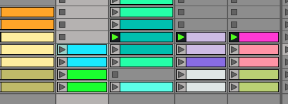
I think what happened is the designer saw an image of Session view, complete with nasty coloured clips and said "hey, I'll use the colours from the app and everyone will feel immediately at home". They probably thought they were integrating.

Here's your turquoise and your lavender sir, why not try a little #00FF00 while you are at it.
Re: New look Ableton website.
Posted: Mon Oct 29, 2012 3:03 am
by simmerdown
i'm used to the new look now, logo, (angstrm re-styled) forum
i use indirect vision on the main site, not really looking, like it was a meat packing plant or something
Re: New look Ableton website.
Posted: Mon Oct 29, 2012 3:05 am
by oblique strategies
Beige? Blue? Glaring white? UGH!

Re: New look Ableton website.
Posted: Mon Oct 29, 2012 3:09 am
by simmerdown
hideous, you gotta do the custom style
Forum color...
Posted: Mon Oct 29, 2012 3:24 am
by Earwax69
hu... anyway to get the white forum back? this weird colors are killing my eyes.
I though it was a temporary glitch..
http://s12.postimage.org/rrlmyhhwb/ableton_ugly.png
Re: New look Ableton website.
Posted: Mon Oct 29, 2012 4:38 am
by pencilrocket
burningfeetman wrote:They'll just bundle the shit out of all their existing assets whilst developing at a snails pace.
Well described

Re: New look Ableton website.
Posted: Mon Oct 29, 2012 6:36 am
by login
The design is good, functional and minimalist, the color scheme is the one that is akward.
Re: New look Ableton website.
Posted: Mon Oct 29, 2012 7:14 am
by [art]
i personally love the new site. easy to see why they hid the forum, it's pretty embarrassing to be honest
Re: New look Ableton website.
Posted: Mon Oct 29, 2012 11:38 am
by netchaiev
The new website is basically a OK tumbler page.
Hard to tell when do you stop scrolling down!
Futura font....hmm
Re: New look Ableton website.
Posted: Mon Oct 29, 2012 3:42 pm
by Bizon
The entire team of web developers at Ableton should be fired!
My 70 year old computer illiterate blind mother could create a better website.
Bring back the old design!!!!!!
Re: New look Ableton website.
Posted: Mon Oct 29, 2012 5:07 pm
by ttilberg
Angstrom wrote:jonny72 wrote:Think the new design and layout is pretty good and up to date. Main issue is some of the colours are out of kilter with the rest of the colour scheme (I'm looking at you turquoise). The top of the Packs page is the worst and looks like something from the 90's.
I think what happened is the designer saw an image of Session view, complete with nasty coloured clips and said "hey, I'll use the colours from the app and everyone will feel immediately at home". They probably thought they were integrating.

Here's your turquoise and your lavender sir, why not try a little #00FF00 while you are at it.
This is actually a very feasible explanation. Well done!
