Page 4 of 18
Re: New look Ableton website.
Posted: Thu Oct 25, 2012 9:07 pm
by ttilberg
lol Tone Deft

I do agree that web design isn't their strong point -- I just more meant how apple presents their products -- One huge long list, with tons of features, huge images... General site navigation is pretty tough to get where you're going (or to notice that there is sub navigation under the feature image on the Live and Push pages)
However, when you look at
http://www.apple.com/ipad-mini/overview/
http://www.apple.com/macbook-pro/
You've gotta think "Abe's designer must have looked at Apple's page and said "Let's present our product like this" -- and why wouldn't they? Apple is ridiculously successful exactly because of their presentation and marketing.
I've been seeing this "style" of product presentation on a lot of sites lately...
When I said they took a play from their playbook, I meant to say a page -- not a chapter

The forum though? omfgggg what is goinnnggg onnnn herrreeeeee. I'd almost prefer default phpBB to this salmon color that clashes with white boxes and black background divs. This is nutso!
Re: New look Ableton website.
Posted: Thu Oct 25, 2012 9:15 pm
by puzzlefactory
I honestly don't see what everyone's problem is. I think the website looks fine.
Re: New look Ableton website.
Posted: Thu Oct 25, 2012 9:18 pm
by Tone Deft
ttilberg wrote:When I said they took a play from their playbook, I meant to say a page -- not a chapter
I see what you mean.
The forum though? omfgggg what is goinnnggg onnnn herrreeeeee. I'd almost prefer default phpBB to this salmon color that clashes with white boxes and black background divs. This is nutso!
it's really tripping me out to see the ol' forum in different colors.
Re: New look Ableton website.
Posted: Thu Oct 25, 2012 9:19 pm
by simmerdown
salmon color
its a fresh new color called Paris's Butt
Re: New look Ableton website.
Posted: Thu Oct 25, 2012 9:35 pm
by Komodovaran
This definitely looks like a desirable, legit and professional product.


...Someone deserves to get fired.
Re: New look Ableton website.
Posted: Thu Oct 25, 2012 9:38 pm
by sporkles
I'm getting a headache trying to read the headlines, like on the "What's new in Live 9" page:

At least the site's responsive now, so you got what you wanted, eh, Angstrom?
Re: New look Ableton website.
Posted: Thu Oct 25, 2012 9:40 pm
by bonomius
what's the font they use in the main page? Thx
Re: New look Ableton website.
Posted: Thu Oct 25, 2012 9:46 pm
by Angstrom
sporkles wrote:I'm getting a headache trying to read the headlines, like on the "What's new in Live 9" page:
At least the site's responsive now, so you got what you wanted, eh, Angstrom?
the irony is .. not lost on me.

Re: New look Ableton website.
Posted: Thu Oct 25, 2012 9:48 pm
by continuous
bonomius wrote:what's the font they use in the main page? Thx
Looks like Futura to me.
Re: New look Ableton website.
Posted: Thu Oct 25, 2012 9:51 pm
by 102455
puzzlefactory wrote:I honestly don't see what everyone's problem is. I think the website looks fine.
You're holding your binoculars the wrong way round!
Re: New look Ableton website.
Posted: Thu Oct 25, 2012 10:20 pm
by ze2be
All this awesome news sudenly, then perfect old webite turned into a flashy hipster foto blog, and a quote: "dildo-pink" forum on top of that is trippy for sure!

Re: New look Ableton website.
Posted: Thu Oct 25, 2012 10:36 pm
by Angstrom
If anyone wants a half-finished userstylesheet for this forum
you need an add-on for either Firefox or Chrome.
https://addons.mozilla.org/en-US/firefox/addon/stylish/
https://chrome.google.com/webstore/detail/stylish/
the following style will make it look like this

Code: Select all
@namespace url(http://www.w3.org/1999/xhtml);

@-moz-document domain("forum.ableton.com") {

body{background-color:#95A2AB!important;color:#43423D!important;font-weight:100!important;}

a, a:link{color:#43423D!important;font-weight:100!important;}
a:hover{color:#476070!important}
#pagecontent a:visited, .tablebg a:visited{color:#7F8D98!important;}
#wrapheader{padding:0!important;}
.row1,
html body.ltr div#wrapcentre div#pagecontent div table.tablebg tbody tr td.row1{background:#EBEFF2!important;}
td.row1 p.breadcrumbs a{color:#E9EAEF!important;font-weight:100!important;}

div#wrapcentre div div table.tablebg tbody tr td.row1{background:transparent!important;}

.row2{background:#E6E9F0!important;}
html body.ltr div#wrapcentre div#pagecontent div table.tablebg tbody tr td.row2{font-size:1.2em;padding:10px 50px!important}
.roundedtl{font-size:1.2em;}
.profile, .roundedtl{background-image:none !important;}

th{background:#D8DDE0!important;color:#403E39!important;font-weight:100;font-size:1.2em;}
div#wrapheader div#menubar div table tbody tr.row1{background:transparent!important;box-shadow:0px 1px 1px #79858E;
color:#E9EAEF;}

.genmed{padding: 10px 20px!important;}
.cornerbr, .cornerbl, .cornertl{display:none!important;}

html body.ltr div#wrapcentre div#pagecontent table.tablebg tbody tr th{color:#43423D!important;font-size:1.2em;font-weight:100!important;}

}
Re: New look Ableton website.
Posted: Thu Oct 25, 2012 11:06 pm
by condra
Right now the website, and this forum are HIDEOUS
Seriously Ableton???
Can't afford a graphic designer so got the interns brother to do it?
Christ.
Re: New look Ableton website.
Posted: Thu Oct 25, 2012 11:32 pm
by robdrums
simmerdown wrote:was i hallucinating that this whole forum was blue for a few minutes?....i liked it
Personally, I liked the old site better. I would have just made the old site more colourful - Moving around this new one is annoying LOL
Re: New look Ableton website.
Posted: Thu Oct 25, 2012 11:33 pm
by robdrums
Angstrom wrote:the new site looks very very strange for me on Win7 firefox.
I'm not sure whether it's just the design sensibilities of the designer don't match with mine, or it's actually broken. The colours are ... not complementary.
 Is this how it is supposed to look?
baby blue, 100% cyan, lilac, Windows 98 blue, pale yellow with light blue text, and sand?
pretty weird.
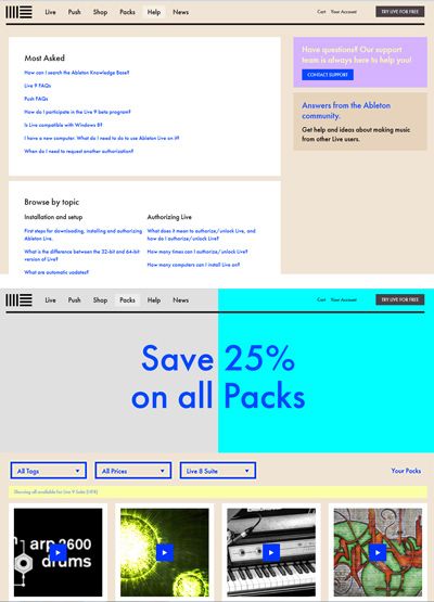
pretty nasty
I agree, when I first saw it, I thought who designed this page and I wonder how they DRESS in teh morning LOL. I would have added colour to the old site before creating this page. IMO