jestermgee wrote: ↑Wed Sep 29, 2021 1:53 am
It's easy enough to see
I don't discount the possibility that some people on certain monitors of a sufficiently low PPI may find those faders easier to see than others. On my 43" 4K display at 125% scaling, sitting about 3 ft from my screen, using the "Mid Dark" theme, I need to look twice before I can make out the triangles. Most of the stock themes use colors that give poor contrast of the triangles against the background. If you casually glance at the mixer, you won't see a distinct "series of dots" like you do on real mixers where the fader caps stand out like a sore thumb. This series of dots is what enables you to visually grasp the state of the mixer, like a photograph. I want to prove this to you: look at the following pictures, you should be clever enough to see my point:
The problem is that there is too much going on on the right-hand side of the fader. We have the tick marks, the numbers, the triangle, which from a distance is almost indistinguishable from the surrounding ticks and numbers. At least putting the numbers on one side and the ticks and the triangle on the other, and using colors that contrast a bit more (basically light on dark or vice versa) would help a lot.
jestermgee wrote: ↑Wed Sep 29, 2021 1:53 am
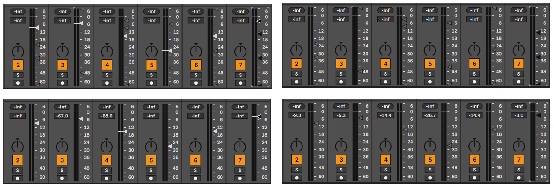
it doesn't cover over the actual number scale, rather sits in the pins which saves having to have that distracting white line you have in your example across the VU meter which would give possibly a false impression that is where the level should be.
and...
jestermgee wrote: ↑Wed Sep 29, 2021 1:53 am
Also, your example actually takes up a little more space which could be far less efficient in a larger set when the tracks are all sized down.
There you have some valid points. What about this?:

This layout can actually save width since the triangle can be pushed closer to the right edge of the track without looking cramped, whereas the numbers being too close to the edge wouldn't look right. That said, in my original mock-up the overall track width is exactly the same as the non-mock-up tracks.
The idea is that the triangle should not completely cover the tick mark, and that it should not be too close to the numbers because it looks bad and cluttered. I think this last mock-up addresses this alright.
jestermgee wrote: ↑Wed Sep 29, 2021 1:53 am
The mouse pointer hides when you click/drag the level control so isn't ever in the way.
That's totally true, oops


 right you are. I can’t even blame it on a deficiency in caffeine intake today.