Don't forget an accented line between each B & C!
+1
Better clip Grid hierarchy, please.. **added some screens**
-
regretfullySaid
- Posts: 8913
- Joined: Thu Apr 22, 2010 5:50 pm


Re: Better clip Grid hierarchy, please.. **added some screens**
+1 I like the second mockup idea of the poster best.
-
Martin Gifford
- Posts: 439
- Joined: Mon Jun 14, 2010 12:48 am
Re:
I prefer this with the larger bolded bar numbers:
Basically, I want everything to do with the interface improved and customisable. I know others don't like it but it's good for attracting newbs and it's good for visually-oriented people. If everything is customiaable, then the people who want things unchanged can keep it that way.
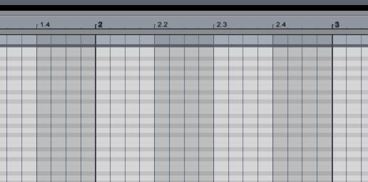
That would make things so much better! ABLETON, PLEASE DO THIS!!!!alvaro wrote:I have added a bit of emphasis on bar numbers (tried to emulate bold font type) and line ends. IMHO its even clearer now:
Basically, I want everything to do with the interface improved and customisable. I know others don't like it but it's good for attracting newbs and it's good for visually-oriented people. If everything is customiaable, then the people who want things unchanged can keep it that way.
-
siliconarc
- Posts: 2838
- Joined: Mon Jul 16, 2007 12:27 pm
- Location: UK
- Contact:
Re: Better clip Grid hierarchy, please.. **added some screens**
just saw that this has finally appeared in Live 9. after seven years.
seven. years.
seven. years.
Re: Better clip Grid hierarchy, please.. **added some screens**
sjeez.. this thread that old? 
but yeah, finally..
but yeah, finally..
Re: Better clip Grid hierarchy, please.. **added some screens**
I've been using the Live 9 beta now for a few months and I didn't even notice they implemented this. Now when I open Live 8 I can't believe it never had this amount of contrast on the grid. Big usability win!
MBP | Live 9 Suite | Max for Live | Push | MOTU Ultralite | iPad | Analog Modular Synths | Moog Voyager
aka "Tempus3r" | Music | Blog | Twitter | Soundcloud

aka "Tempus3r" | Music | Blog | Twitter | Soundcloud