Page 6 of 7
Re: Shameless self-promotion aside...
Posted: Fri May 03, 2013 8:41 pm
by andydes
shadx wrote:a few beats short of a measure

I have no interest in this argument at all. Just popped in to say I like this expression.
Re: Shameless self-promotion aside...
Posted: Fri May 03, 2013 9:13 pm
by H20nly
that's good for a type writer or a novel about romance with Fabio typed with one... not for logos.
Re: Shameless self-promotion aside...
Posted: Fri May 03, 2013 9:48 pm
by regretfullySaid
your lack of equal spacing violates the eyes.
Please start distributing rape kits if you're going to keep that logo.
all of these monospaced fonts do not exhibit any kind of illegal or creepy spacing, pervo.
Or *gasp* don't use a monospace font /ducks
What about this font?

Re: Shameless self-promotion aside...
Posted: Fri May 03, 2013 9:51 pm
by andydes
Latest version could use some horizontal red stripes.
Go on Funken, you know you love it.
Re: Shameless self-promotion aside...
Posted: Fri May 03, 2013 9:59 pm
by H20nly
^
Funken the 51st State!
Re: Shameless self-promotion aside...
Posted: Sat May 04, 2013 12:00 am
by regretfullySaid
You need to repeat it at least 9 times, because I just picked that number semi-randomly.
But hey, do your thing. It's your empire, or shall we say, Funkpire?
So, the typewrite thing...is there supposed to be some subliminal aspect to it? Cuz I'm pretty sure most of the people who have seen your banner, have never read a paper typed on by a typewriter. I'm betting most of them haven't seen an actual typewrite in person except for in a museum, the movies, or their hipster friend who totally rules the high school newspaper. Kinda classy, though. A little militant, which is fitting. Still, the spacing hurts my eyes butts.
But do your thing mang. Do your thang. This is your time. Embrace it.
Re: Shameless self-promotion aside...
Posted: Sat May 04, 2013 4:14 am
by timothyallan
What if you're having a 50% off sale?? Is it okay then?
Re: Shameless self-promotion aside...
Posted: Sat May 04, 2013 8:22 am
by regretfullySaid
The logo.......it's growing on me.……
not as good as Tim's though
Re: Shameless self-promotion aside...
Posted: Sat May 04, 2013 10:04 am
by regretfullySaid
It's shit stick with typewriter otherwise everything you worked will go down the drain and all hope is lost.
Re: Shameless self-promotion aside...
Posted: Sat May 04, 2013 11:09 am
by lowshelf
Ken the thing is, you haven't got multiple lines of text which gives fixed width fonts their structured look. These are better reserved for code, email messages, or signature text; things that God intended to be compact. Doesn't readily work for a logo, especially when your site is a compound word (mac ableton), which gets confused by the bunching. It looks like you pulled the warp markers left for some Flying Lotus typography. But thanks for fixing the stars.
Re: Shameless self-promotion aside...
Posted: Sun May 05, 2013 5:59 pm
by H20nly
it looks like in the end you kerned the letters and got the spacing right. well done.
Re: Shameless self-promotion aside...
Posted: Sun May 05, 2013 6:13 pm
by regretfullySaid
I think we have a winner!
Re: Shameless self-promotion aside...
Posted: Sun May 05, 2013 10:06 pm
by H20nly
now, we could request to have it put on a missile if you'd like


Re: Shameless self-promotion aside...
Posted: Sun May 05, 2013 10:23 pm
by Machinesworking
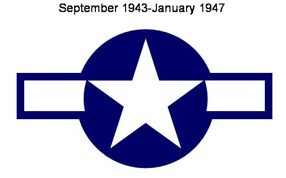
^ or on a plane. US Air Force that is.
Re: Shameless self-promotion aside...
Posted: Mon May 06, 2013 5:08 pm
by Machinesworking