Page 7 of 18
Re: New look Ableton website.
Posted: Fri Oct 26, 2012 3:21 am
by deaddisneyy
The design of this new site is ridiculously bad. I like the photography as well, but it can be implemented a thousand times better than it is currently.
I thought Germans were supposed to be the kings of design. What the fuck happened?
Re: New look Ableton website.
Posted: Fri Oct 26, 2012 3:23 am
by ze2be
Re: New look Ableton website.
Posted: Fri Oct 26, 2012 3:25 am
by nathannn
deaddisneyy wrote:The design of this new site is ridiculously bad. I like the photography as well, but it can be implemented a thousand times better than it is currently.
I thought Germans were supposed to be the kings of design. What the fuck happened?
yeah the photography is great there really is nothing wrong there.. its mainly the shop and having to scroll and scroll and scroll to find information.
Re: New look Ableton website.
Posted: Fri Oct 26, 2012 3:26 am
by merges
Brutal.
Scale is used terribly; the wrong things are big. Indeed, the whole site is so big so as to require incredible amounts of scrolling, yet the informational text is so tiny so that it is difficult to read without zooming in and making the whole site even MORE difficult to get an overview of. Lots of scrolling or flicking and panning to find anything.
Sketchy affordances—what's clickable, what's not? Click everything and find out!
Clever attempt at, but poor execution of, typography.
The rest of the site lacks structure, obvious information architecture. Really a poor job overall. Random squares of cyan notwithstanding.

Awful design.
However, Live *itself* is an incredible achievement in restraint, aesthetic integrity, and user experience.
I am flabbergasted that this came from Erik Spiekermann's studio. Imagine you let these guys design an airport (or at least its wayfinding system). Good luck getting to your flight on time or finding the bathroom.
Re: New look Ableton website.
Posted: Fri Oct 26, 2012 3:27 am
by 3dot...
Re: New look Ableton website.
Posted: Fri Oct 26, 2012 3:35 am
by 3dot...
I've figured it out...
you need to use PgDwn
I actually missed some of these small video boxes with nice details going through the site a couple of times...
Re: New look Ableton website.
Posted: Fri Oct 26, 2012 3:36 am
by Hidden Driveways
I will say this. The aspect that I appreciate about the new design is that by mainly showing people's desks, the scale becomes very human. Instead of mystifying the software with a bunch of bullshit, they're just showing people's workstations. They're saying, look, here it is, this is what this is. I like that.
Everything else is a train wreck. The site works much better at home on my Mac with the Chrome browser, but it still seems ill conceived. On my work PC on IE and XP, it was beyond amateur. It's a complete disaster.
I too detect a bit of resentment and hostility in the color choices for the forum. It really does hurt your eyes to look at it, and the community is nowhere to be found on the main site.
Someone remarked that this was the worst forum they had ever seen. I disagree:
http://messageboard.tapeop.com/
Re: New look Ableton website.
Posted: Fri Oct 26, 2012 3:38 am
by deaddisneyy
Whats even worse about scrolling through all the packs, is trying to demo one and listen to the different audio examples.
You have to wait until the entire clip is done playing to hear the next one...
This is a super nice feature especially for certain packs where the first demo is like 1:42 long

Basically Ableton:

Re: New look Ableton website.
Posted: Fri Oct 26, 2012 6:47 am
by OzWozEre
FWIW, I like the new bold approach especially when coupled with the great photography.
The problem is, when you take such a bold approach, it's very hard to keep things cohesive/consistent when you move down to sub-pages that are more substantive/informative and less "showy", like that Packs page (ewww).
I have a feeling that they started out strong, and then had to rush all the supplemental pages because of some deadline...
...the jury is still out on the new logo refresh for me, I keep seeing the old EIII logo =D
Re: New look Ableton website.
Posted: Fri Oct 26, 2012 7:45 am
by pencilrocket
Tone Deft wrote:disagree. Apple's web site is great design because it's not cluttered with crap.
No Apple's web site is crap. Annoying Quitck time movie, foolish bolded catch phrases everywhere, crappy dynamic javascript page, cheesy video and etc. It's getting worse and worse. I can agree their site design WAS good.
Re: New look Ableton website.
Posted: Fri Oct 26, 2012 7:48 am
by 8O
Last night I had crazy dreams, fuelled no doubt by the forum's lurid colours, but I woke up with the design inspiration for the main site, the layout, the images, even the font change:

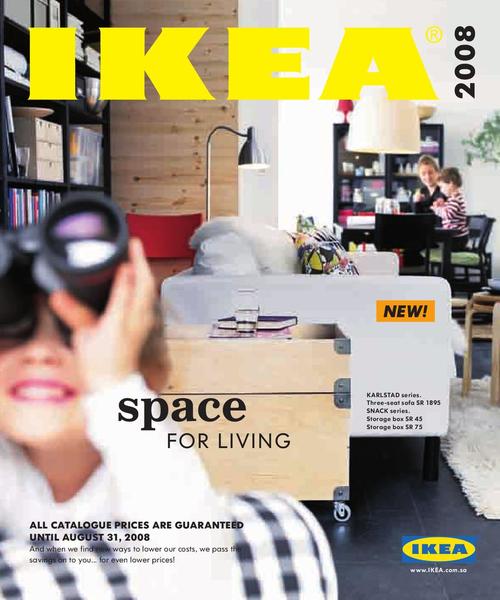
Seriously, the main page is an Ikea catalogue, the bit with lots of products scattered in tasteful haphazardness. The forum is the back page of the catalogue with the index and simplified directions to the local branch.
Re: New look Ableton website.
Posted: Fri Oct 26, 2012 8:18 am
by Linear Phase
8O wrote:Last night I had crazy dreams, fuelled no doubt by the forum's lurid colours, but I woke up with the design inspiration for the main site, the layout, the images, even the font change:
Seriously, the main page is an Ikea catalogue, the bit with lots of products scattered in tasteful haphazardness. The forum is the back page of the catalogue with the index and simplified directions to the local branch.
I am laughing so hard!!!!!!!!!!!!! Its not even LMFAO, its plain hard laughter!!
Re: New look Ableton website.
Posted: Fri Oct 26, 2012 8:23 am
by Komodovaran
pencilrocket wrote:Tone Deft wrote:disagree. Apple's web site is great design because it's not cluttered with crap.
No Apple's web site is crap. Annoying Quitck time movie, foolish bolded catch phrases everywhere, crappy dynamic javascript page, cheesy video and etc. It's getting worse and worse. I can agree their site design WAS good.
Huh? The Apple website loads extremely fast for me, and all the images gently fade into existence, instead of the site slowly building itself up from the ground, like most other heavy sites seem to do. Their site is great.
Re: New look Ableton website.
Posted: Fri Oct 26, 2012 8:27 am
by Linear Phase
Re: New look Ableton website.
Posted: Fri Oct 26, 2012 9:33 am
by pencilrocket
Komodovaran wrote:pencilrocket wrote:Tone Deft wrote:disagree. Apple's web site is great design because it's not cluttered with crap.
No Apple's web site is crap. Annoying Quitck time movie, foolish bolded catch phrases everywhere, crappy dynamic javascript page, cheesy video and etc. It's getting worse and worse. I can agree their site design WAS good.
Huh? The Apple website loads extremely fast for me, and all the images gently fade into existence, instead of the site slowly building itself up from the ground, like most other heavy sites seem to do. Their site is great.
Huh? Who are talking about speed? We are talking about the design. Apple fanboy can't stay on topic funny.