Page 1 of 7
So I'm hating on the new Live 6 splash screen
Posted: Tue Oct 31, 2006 10:10 pm
by rasputin
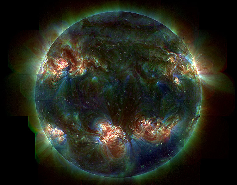
I know it sounds stupid, but every time I launch it just for the short time it's up there it annoys me. So I modified the .tif file in the versions folder (probably voiding the warranty, oh well, there is no warranty)
http://viewmorepics.myspace.com/index.c ... 1364345727
Now I smile while looking at it at Live 6 startup time...hm, looking at it I can already see some tweaks I want to make. Seems to not break anything in the demo version at least...now to make the same mods in the other tifs...
To give proper credit; that UV image of the sun came from NASA:
http://antwrp.gsfc.nasa.gov/apod/image/ ... _trace.jpg
Posted: Tue Oct 31, 2006 10:12 pm
by Johnisfaster
yeahhhh hehe...
I think someone said they replaced it with paris hilton of all things a while back.
ha
Posted: Tue Oct 31, 2006 10:14 pm
by Johnisfaster
somebody should steal the fruityloops splash and then twist it to say ableton next to those stupid orange fruit
Posted: Tue Oct 31, 2006 11:18 pm
by joesapo
Posted: Tue Oct 31, 2006 11:39 pm
by kabuki
Posted: Tue Oct 31, 2006 11:50 pm
by ikke
i actually like the new splash screen it looks like a circus. really colorful, i like colors
the earth pic you made there is awful though.. horrible.. wheres the taste ?
Posted: Wed Nov 01, 2006 12:02 am
by John Sweet
The art this time around looks like the junk they put on the outside of those big free folders they give you in music class when you're little.
It's well done and all, but to me they let the style slide to hawk the EIC instead. Bad move.
Posted: Wed Nov 01, 2006 12:11 am
by ikke
todays art is wack
i mean.... conceptional bullshit it is
ive been to art school my entire life and when i saw what todays artists were doing i gave up.. its a joke. most of them cant even draw a nice real looking picture of themselfs.. its a pitty and im ashamed ive been to art school
Posted: Wed Nov 01, 2006 12:12 am
by Machinate
I love the little red piano. Hellooooo little red piano!
Posted: Wed Nov 01, 2006 9:09 am
by fatrabbit
Posted: Wed Nov 01, 2006 10:01 am
by peeddrroo
ikke wrote:i actually like the new splash screen it looks like a circus. really colorful, i like colors
the earth pic you made there is awful though.. horrible.. wheres the taste ?
+1
+100000
Machinate wrote:I love the little red piano. Hellooooo little red piano!
haven't i already read that somewhere before...

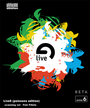
here was one of martyn's brilliant splashes (a bit smelly though)
Posted: Wed Nov 01, 2006 10:16 am
by Benshik
This would make a great splash screen for Photoshop v 1.0
Posted: Wed Nov 01, 2006 5:59 pm
by rasputin
ikke wrote:
i actually like the new splash screen it looks like a circus. really colorful, i like colors
the earth pic you made there is awful though.. horrible.. wheres the taste ?
todays art is wack
i mean.... conceptional bullshit it is
ive been to art school my entire life and when i saw what todays artists were doing i gave up.. its a joke. most of them cant even draw a nice real looking picture of themselfs.. its a pitty and im ashamed ive been to art school
Sorry you didn't like my try at the splash screen; not having been to art school of course I am a mere poseur. You ought to take a try at it; with your taste and ability I would be interested in seeing what you come up with.
r.
Posted: Wed Nov 01, 2006 9:55 pm
by grainshifter
i like the terragon stuff...
Posted: Wed Nov 01, 2006 10:06 pm
by Machinate
peeddrroo wrote:Machinate wrote:I love the little red piano. Hellooooo little red piano!
haven't i already read that somewhere before...
It's totally the hip phrase for the new millenium. All the cool kids are saying it.