Discuss music production with Ableton Live.
-
grizzler
- Posts: 267
- Joined: Mon Feb 26, 2007 11:10 pm
Post
by grizzler » Fri Jun 27, 2008 12:48 pm
We have a new EP comming out and just deciding on artwork. We have had a few mates have a go and i stuck between deciding out of the last two. So thought i would come here to see your views etc! So post away! Thanks
-
Meef Chaloin
- Posts: 2164
- Joined: Thu Jul 21, 2005 10:09 pm
Post
by Meef Chaloin » Fri Jun 27, 2008 12:57 pm
what music is it?
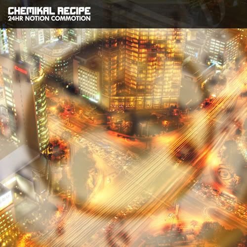
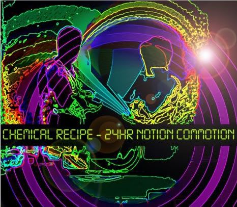
second one looks kind of disco
the white layer on the first could be a bit more subtle imo
both cool though
-
b0unce
- Posts: 5379
- Joined: Wed Apr 19, 2006 4:16 pm
Post
by b0unce » Fri Jun 27, 2008 1:00 pm
nice tunes Grizzler,
not the answer you were going for...but I'd use the image you used for 'sunset eclipse', if it wouldn't be in breach of copyright. Choosing from what you posted here, I'd probably choose the first one.
spreader of butter
-
Heiko
- Posts: 238
- Joined: Mon Oct 31, 2005 2:02 am
- Location: Amsterdam
-
Contact:
Post
by Heiko » Fri Jun 27, 2008 4:22 pm
Use the E.T. one, love that!
seriously, totally same as above: the plane, or from this page the first, like them both, cool and catchy!
-
ethios4
- Posts: 5377
- Joined: Tue Dec 02, 2003 6:28 am
Post
by ethios4 » Fri Jun 27, 2008 4:27 pm
I'd say #1, but lower the opacity of the white layer.
-
Pitch Black
- Posts: 6722
- Joined: Sat Dec 21, 2002 2:18 am
- Location: New Zealand
-
Contact:
Post
by Pitch Black » Fri Jun 27, 2008 4:31 pm
1.
The text is SO much classier. The whole thing has better production value* if you ask me.
* terrible phrase to use, I know
-
Machinate
- Posts: 11648
- Joined: Thu Jun 24, 2004 2:15 pm
- Location: Denmark
Post
by Machinate » Fri Jun 27, 2008 4:36 pm
ethios4 wrote:I'd say #1, but lower the opacity of the white layer.
+1, but instead of lowering the opacity I'd try different composite modes... burn, for instance. lowering the opacity would make the whole "clock+busy" more difficult to discern.
mbp 2.66, osx 10.6.8, 8GB ram.
-
Sales Dude McBoob
- Posts: 2844
- Joined: Thu Dec 02, 2004 9:34 pm
- Location: Durham, NC. USA
-
Contact:
Post
by Sales Dude McBoob » Fri Jun 27, 2008 4:39 pm
I like the 2nd one better, but I'd lose the lens flare.
The first one just looks like some lame part of a city with a big fancy boring hotel and a huge 6 lane highway. It looks like the parts of cities I do my best to avoid - and therefore would not be enticed to buy the record.
-
ethios4
- Posts: 5377
- Joined: Tue Dec 02, 2003 6:28 am
Post
by ethios4 » Fri Jun 27, 2008 4:42 pm
Good call Machinate
-
Pitch Black
- Posts: 6722
- Joined: Sat Dec 21, 2002 2:18 am
- Location: New Zealand
-
Contact:
Post
by Pitch Black » Fri Jun 27, 2008 4:55 pm
Is that the Canon logo on the building in the top pic? Photoshop it to Chemikal...
-
grizzler
- Posts: 267
- Joined: Mon Feb 26, 2007 11:10 pm
Post
by grizzler » Tue Jul 01, 2008 2:42 pm
I would love to change it to chemikal but i dont think i have the skills to do that sadly

ill see if anyone i know has! That could be a killer.
The dude who did the second one produced another design same sorta style, but the text will be changed to black. Tell me what you think
Number 3 -

-
Machinate
- Posts: 11648
- Joined: Thu Jun 24, 2004 2:15 pm
- Location: Denmark
Post
by Machinate » Tue Jul 01, 2008 2:48 pm
fake lens flare == design disaster ... I calls them like I sees them.
-
jeskola
- Posts: 1856
- Joined: Wed Dec 01, 2004 1:04 pm
Post
by jeskola » Tue Jul 01, 2008 2:55 pm
Neither

Sorry - i don't like either

I like the colours of the second one, but I don’t like it’s obvious just a photoshop filter.